Happy new year!
It’s been a long ride with us since we’ve started this small space back in 2011. We didn’t even think that we’d last this long either– my blogs usually live within a span of a year or two, then dissipate right after; but lo and behold, we’re still alive and kicking.
Yeap! You got that right: we’ve just turned 3. Though we got the URL in December, we didn’t start working on our stuff not till January. We’ve got a lot of stuff going in on the past three years, particularly the last one, since we were able to accomplish more during that time.
2013 marks the year that we’ve been able to reach out to content creators in the Japanese music industry, particularly the label of PINC, to whom DECO*27 and fhána are home to. We’ll be sure to hear more new releases in the future for these awesome artists!
Site Optimization: We’ve been constantly embattled by site loading speed and accessibility, particularly since we’ve adopted a responsive template via Pagelines. One thing for certain was that for some reason the site got bogged down by plugin bloat as we’ve begun installing plugin after plugin stuff that we needed that wasn’t native to the template. So this year, we’ve moved forward with Metro from MyThemeShop. It had all of the goodies we’ve been looking for in a theme.
Speed Improvements: Further improving the speed of the site load was a priority, given that we’ve been seeing an increase in visitors from mobile devices (and that we’re responsive, too!). We have activated both Server-Side caching on IIS ever since we’ve started hosting our own and used Cloudflare for CDN, as well as Photon from Jetpack. We’ve done these sites and all, but still were unsatisfied with a page load speed of 7.42 seconds. After searching for a solution, we’ve found that Google has offered their PageSpeed service for developers. After several sleepless nights in trying to implement this correctly, we’re now sailing on Google Datacenters all over the world. 😀
Shiny new logo: given that we’ve reached a milestone with our third year, I’ve decided to update our logo a bit and give it a bit more spunk.
I used the two fonts Sansation Light for ‘Sakura’ and Museo Sans for ‘Index’. I love the way the ‘k’ was unique against an otherwise clean sans-serif font. Museo’s strong and clean pronouncement in its design gives a solid feel for the foundations of Index. The two squares in the old logo are now placed in the end of the words, indicating brevity and finality. We’ve retained the original colors of the squares instead of re-coloring it, since the two have been a good indicator for our identity and brand. Set against a white and clean background, the new logo will look and feel clear, concise and authoritative, bringing out the true personality of the site.
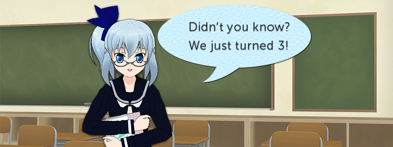
Banner was also redesigned along with it, with design and imports using ComiPo! as the 3D and character rendering engine:
I imported the work done by Kadacho-sensei last year and incorporated her designs into the design assets in the program. Well, I’ve reproduced the work as close as I could. Hope it’s to your liking!
And finally, custom fonts. Though the theme has built-in Google Fonts integration, I decided to try fooling around with Adobe’s Typekit, which comes in with my Creative Cloud subscription. With a quick code insert like Google Analytics and a selection of CSS selectors we’ve implemented them seamlessly—though I’m still having trouble with the h1 font changes…
So far it hasn’t affected page loading speed—it’s an added JS on the site!
In closing
There you have it—that was a long one! We’ve done so much in the past year. And here’s to hoping that you’ll be with us from here on.
これからよろしくおねがいします!(^_-)-☆


