Hi there!
If you’ve been with us yesterday, you’ve probably known that we’ve just updated the site’s template and logo. Also, we’ve added in our very own mascot! Yay!
The Template

The template we’ve chosen to use Pagelines as our new framework, as it offers a lot of customization options, as well as the ability to enter custom code without messing with the current features. It is a truly wonderful template framework, so give it a try!
Responsiveness: The site is now fully-responsive, so you can view it on a mobile device. We’ve been looking into switching to a theme that has a mobile version in it; however with the recent surge in mobility, we’ve decided on using a responsive template rather than get a separate one for mobile.
Issues: For some reason the template breaks when we load up W3 Super Cache. Some of the JS links get a 404, and then many of the images break. Also, Cufon, our custom font replacer, isn’t also friendly with this plugin. Anyone else out there experiencing the same problem? We’re still in the process of debugging this problem; so until then, we’re ditching the Static Server from serving our images at the moment (except for downloads).
New Logo
We’ve also redesigned the site’s logo so it reflects what the site should be: simple, and focused on content.
The logo sports two boxes with different hues of colors. The first box in the front is large, which symbolizes our site’s content, which will be heavy on media such as photos, videos and a lot of desktop customization items (since we’ve been offering a lot of that lately XD). The lighter box at its back symbolizes the content that shows the underlying reasons and stuff that covers some of the content, which probably would fall under our analysis posts and reviews. The lighter color hopes to “shed some light” on some of the topics. the two boxes together symbolizes the responsiveness of the site, which means that we can and could deliver across different devices and media.
The type font that was used in the logo was Eras Light and Eras Demi. These two fonts look clean and professional, and at the same time unique. I was actually considering using ClanNarrow or Helvetica Neue in the logo typeface, but they are either too thin or too broad for the logo; they will look distorted on a logo that’s smaller than 100x50px.
We do plan on using this logo on our new batch of Calling Cards and lol, maybe T-Shirts? Something that we can use during event coverages. XD
And oh, as a last note, we’ll be using the same style and font across all of the services that are offered under the Sakura Index Network. 😀
The Mascot
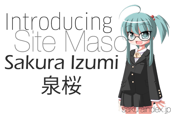
And of course, we’ve got to introduce our new mascot! Say hello to Sakura Izumi-chan!

We created her by using the Character Creator by KH Mix. It’s a free utility, so go check it out! We’re also looking to actually drawing the character, but my drawing skills are pretty rusty as of late ^^;
You’ll be seeing her in other pages, such as the Welcome Page, Search and the 404 page. She’ll be around guiding you, too, on our future updates on the vocabulary series.
The name Sakura Izumi was taken out of a thought: “Our site’s initials is S.I., so we need a name along the same line” (I know, corny!).
桜 - Sakura - Cherry Blossom
泉 - Izumi - Fountain/Spring
We also thought to keep the name simple, so we didn’t try messing around with second kanji readings and such. But yeah, this is still limited by my knowledge of Japanese, since I’m still on Elementary 3. If you’ve got a suggestion go ahead and leave a message below 😀
Whew. There we go with our update. We’ll be posting up too on future events shortly, and also a new post from our new writers.
Thank you and enjoy your stay 😀


![[Wallpapers] Sword Art Online](https://www.sakuraindex.jp/wp-content/uploads/2012/09/uki113-150x150.jpg)
